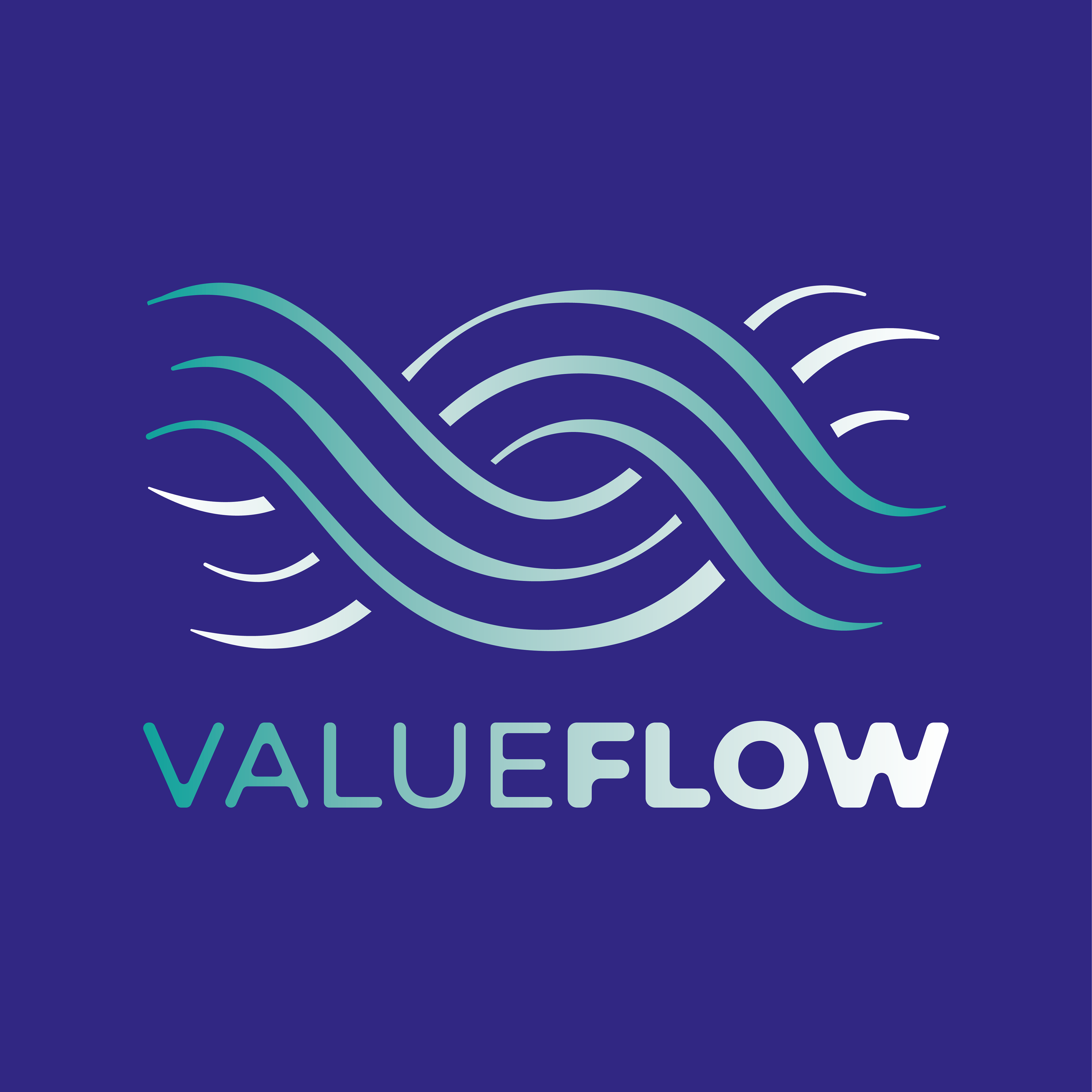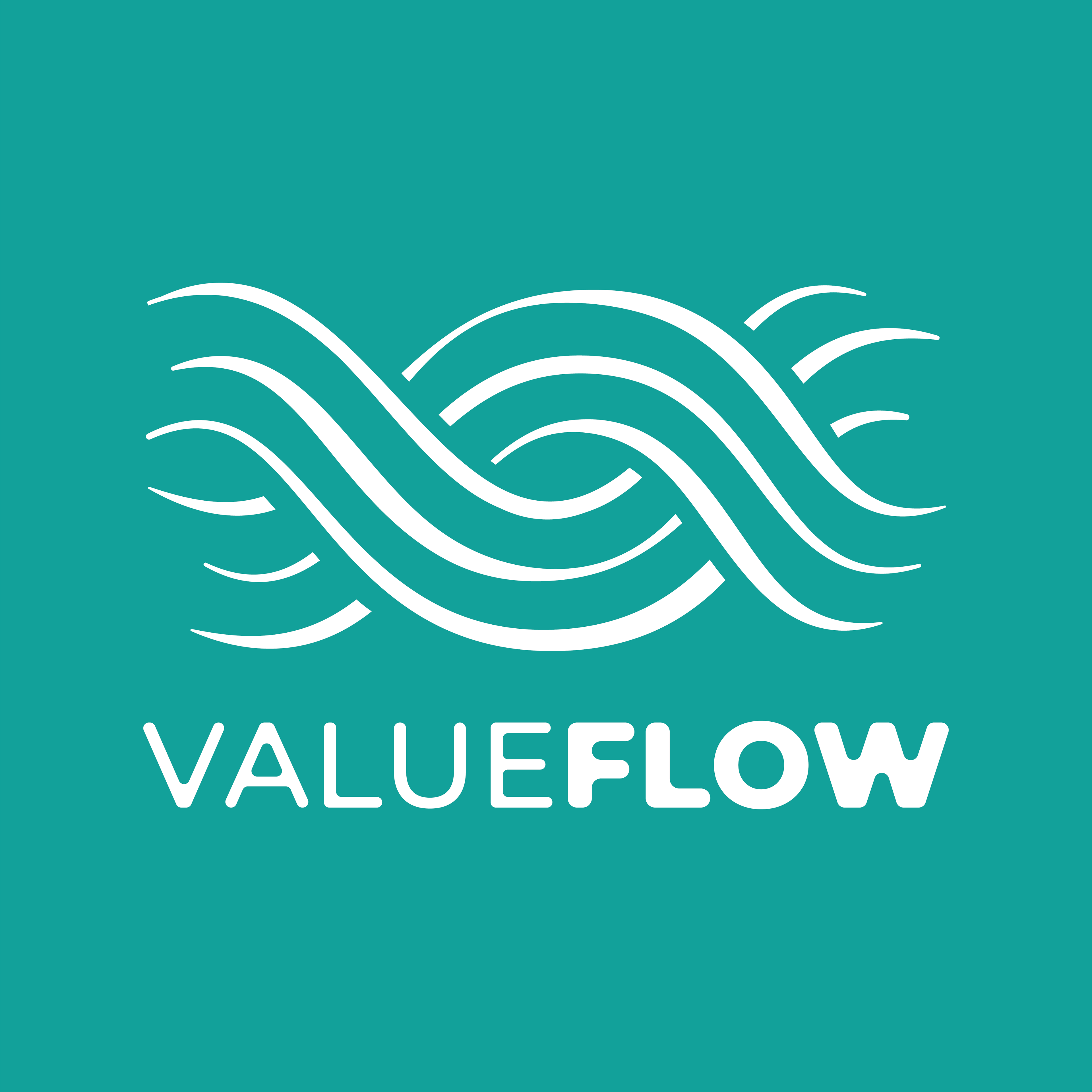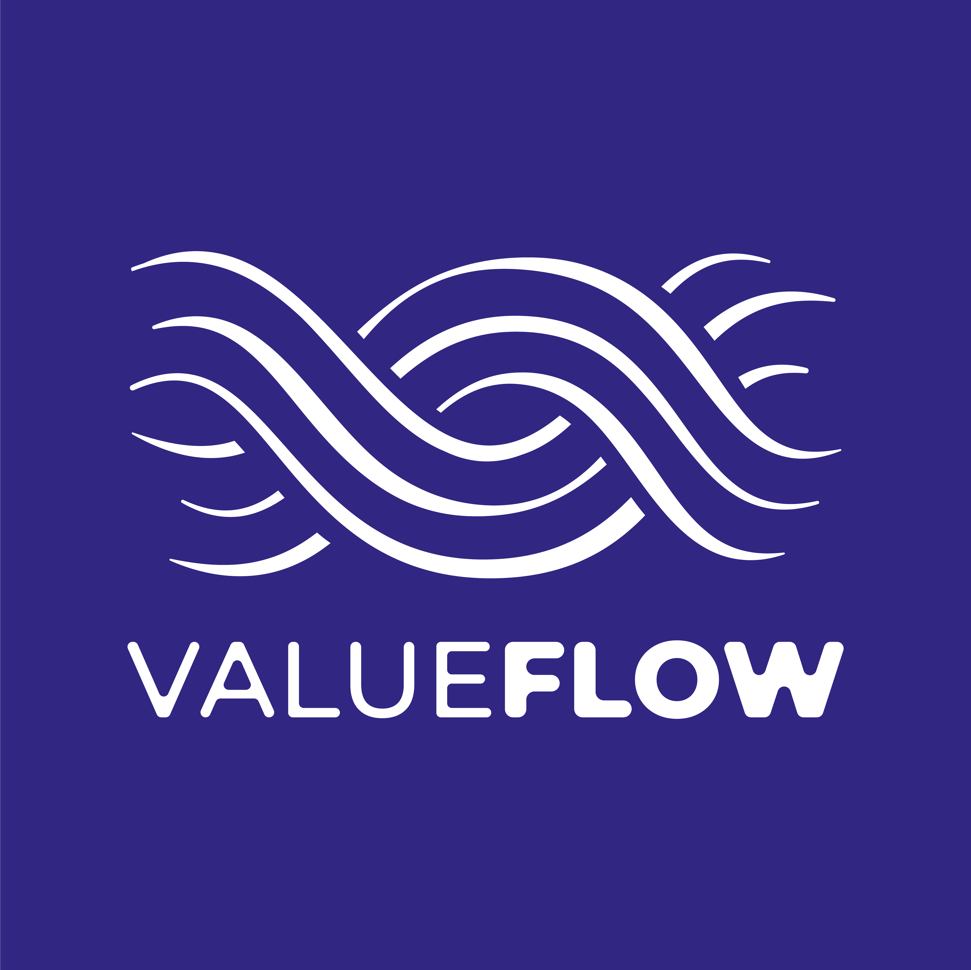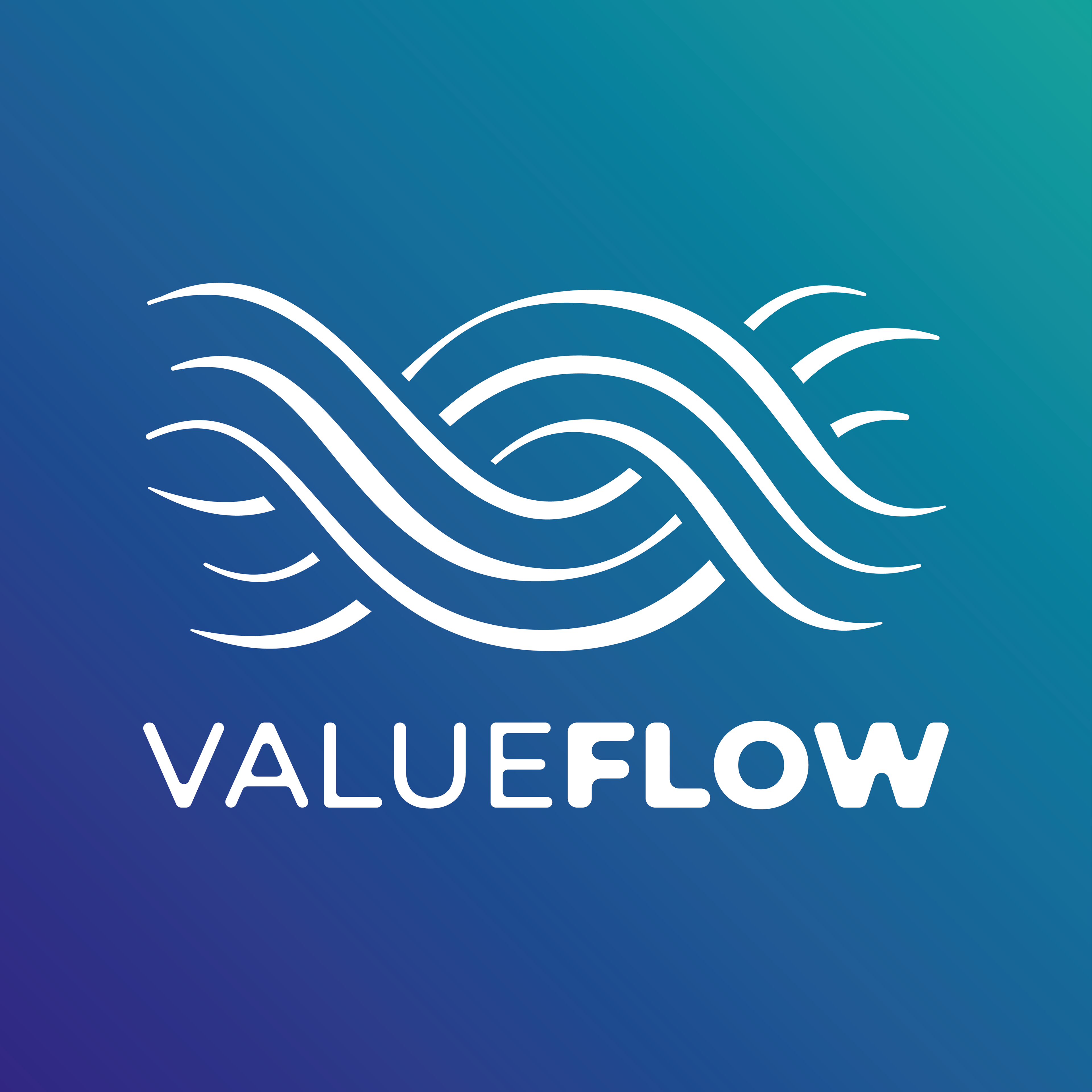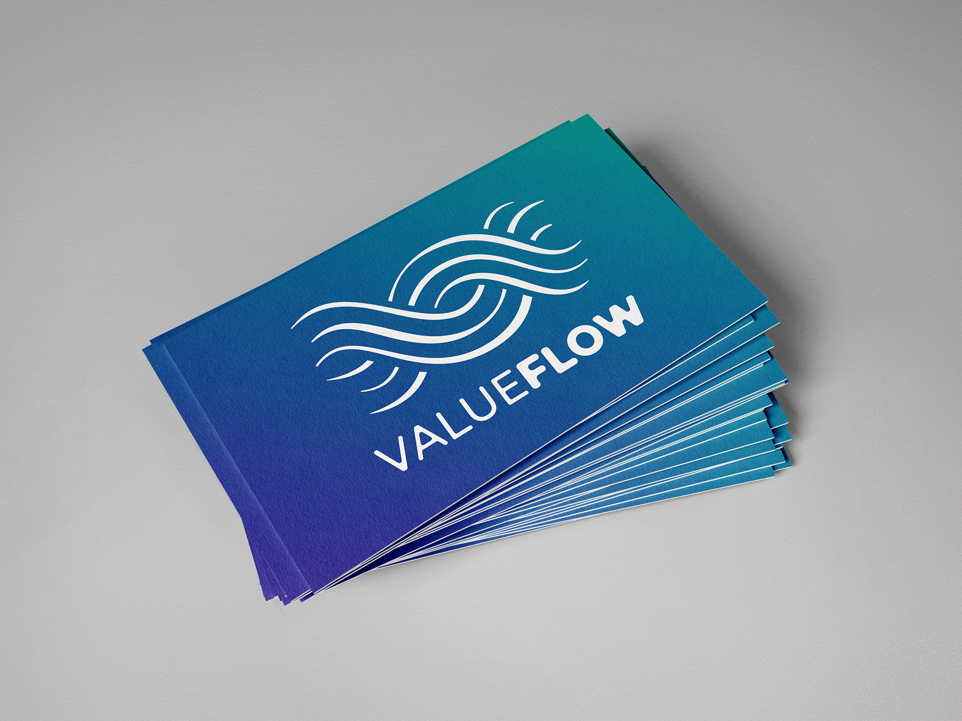
This is the final result I reached after several meetings with the client in which he told me, and my design colleagues at Sapient SEE, what Value Flow was about, and which were the main values that they wanted to evoque in their brand identity.
The main focus points were:
- Having a distinctive logo that was serious enough to blend in the economy world and build trust and credibility, but also playful and in line with nature.
- Portraying the natural flow of the elements, such as water and wind, and the way they move.
- The V and the F, corresponding to the capital letters of Value Flow.
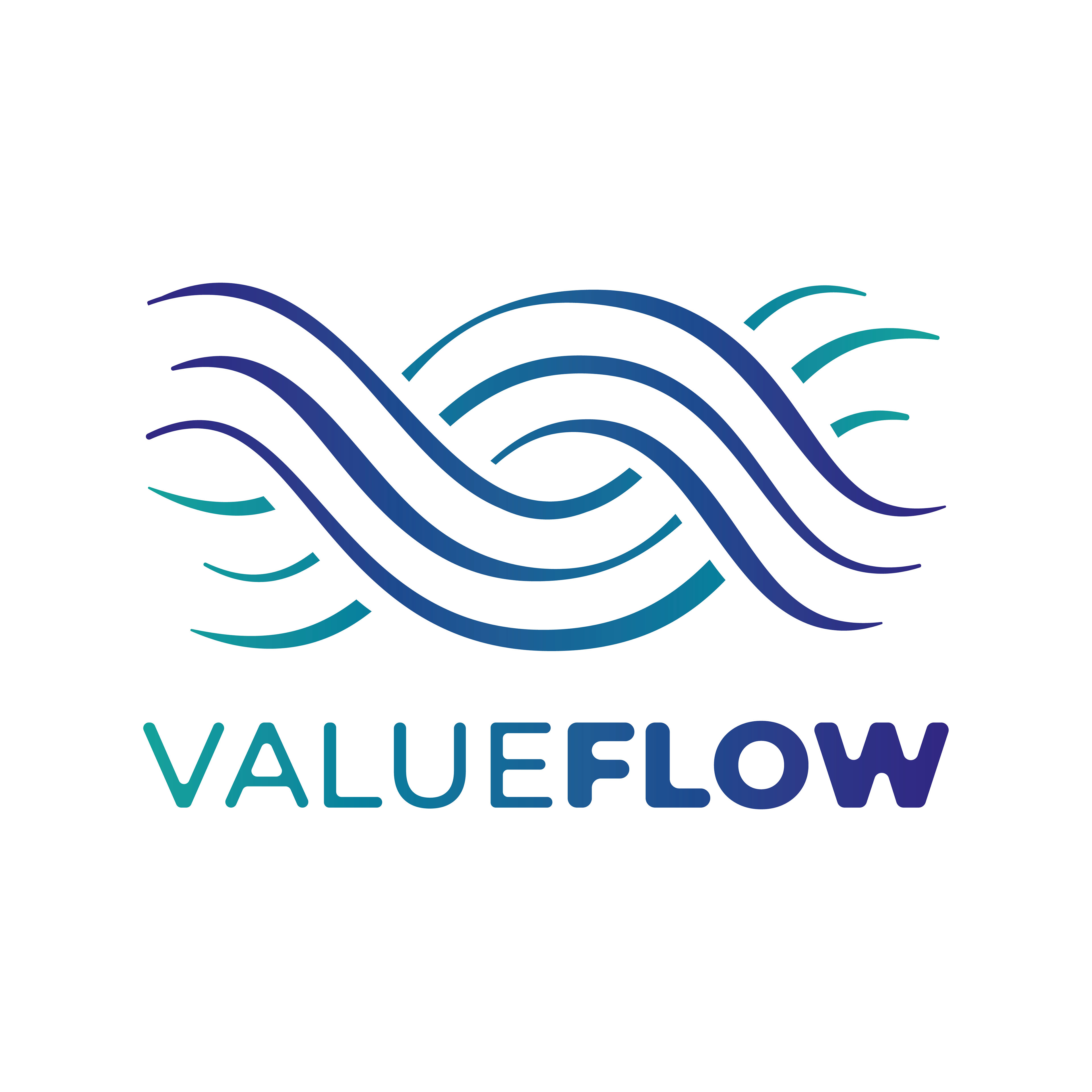
The following are the first drafts of the logo.


The Value Flow team deliberated and picked the second logo, from right to left. I created the logo thinking not only in the elements that were requested by the team, but also focused on the helix created by the flow (which also looks like a wide v), representing the DNA helix and relating to the way that Value Flow wants to change the DNA of the economy from within.
The team also requested some final tweaks to it:
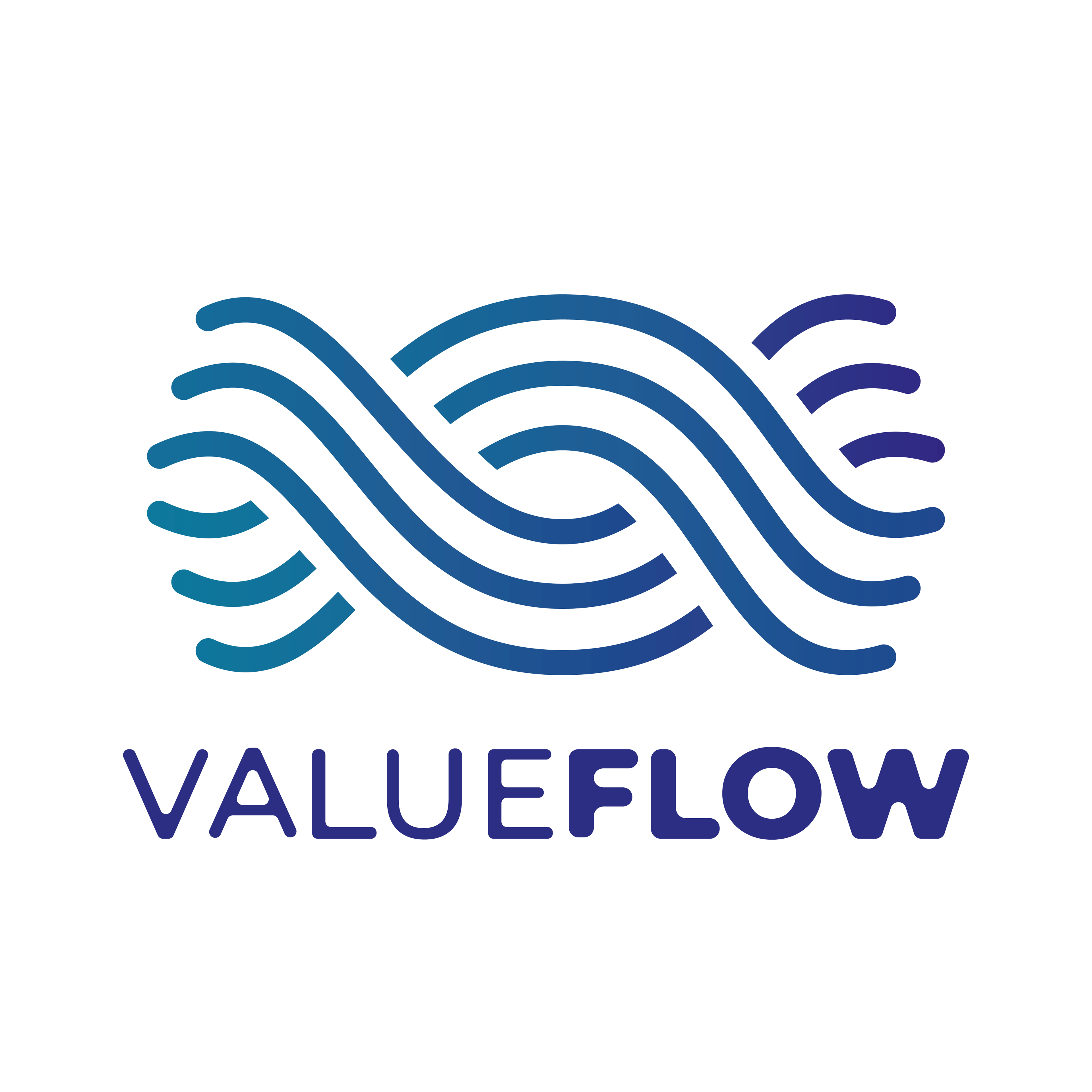
- Make the lines less heavy
- Portray the "perfect imperfection" of nature, making the lines wary in width
- Replicate the gradient in the text
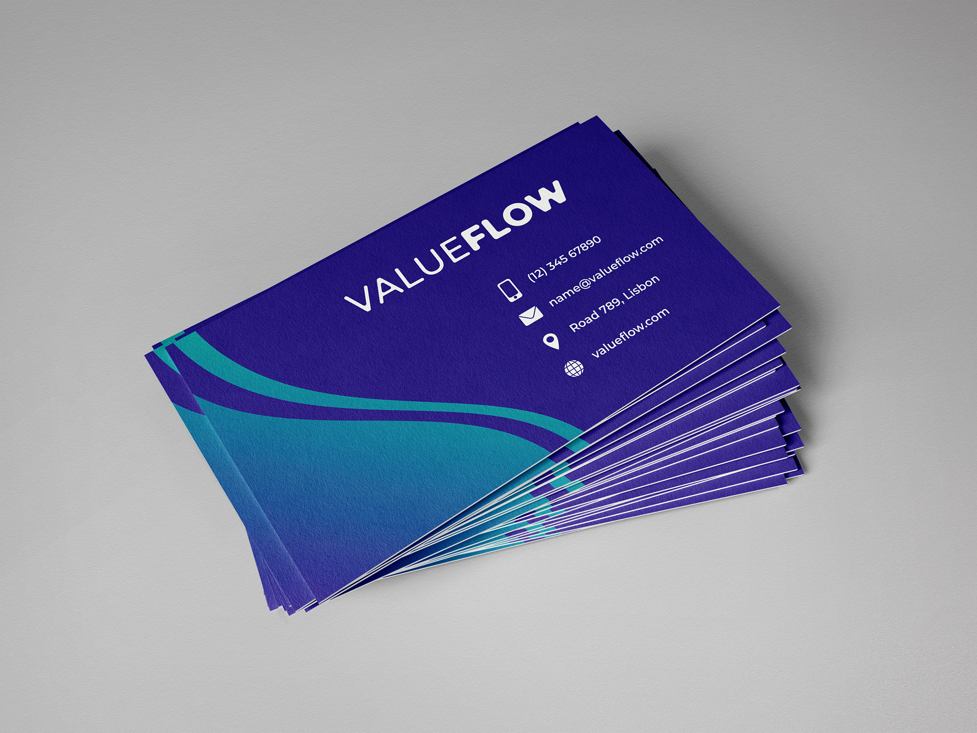
It was by doing these changes that I was able to get to the final version of the logo, that I showed in its various potential colour combinations, as well as uses through mockups.